Back

Forward
Riddle UI
Usage
Design system
Design system
Pricing
Premium
Likenesses
AlignUi
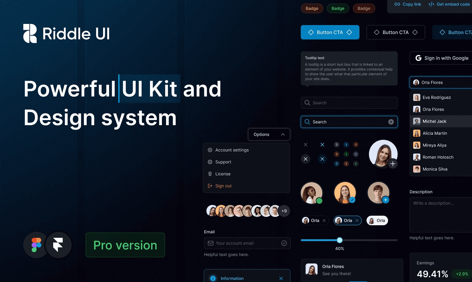
Riddle UI is a robust design system that takes inspiration from Tailwind UI and provides a comprehensive set of customizable, reusable components and styles for building beautiful user interfaces. It aims to be the largest and best Figma UI kit available, catering to the needs of designers working on various projects.
Extensive Styles
The design system includes 1000+ global styles, ensuring consistency throughout your designs. This makes it easier to maintain a cohesive visual identity across different projects.
Typography System
Riddle UI provides a smart and scalable typography system that can be adapted to fit any project. This allows for consistent and aesthetically pleasing typography choices across various screens and layouts.
Practical Color System
With a huge and accessible color system, designers have a wide array of color options to choose from. This ensures that the chosen color palettes are both visually appealing and functional.
Vast Component Library
Riddle UI boasts a collection of over 12,000 components and variants. This extensive library allows designers to easily select and customize components to fit their specific needs, saving them from reinventing the wheel for every project.
Auto Layout and Smart Variants
The design system is meticulously crafted using Auto Layout 4.0, smart variants, and component properties. This ensures a responsive and adaptable design experience, making it easier to create designs that work well across different screen sizes and orientations.
Updated with Figma Features
Riddle UI stays up-to-date with the latest features announced in Figma. This integration with the popular design tool ensures that designers can take full advantage of the platform's capabilities while using the design system.
Ready-to-Go Page Examples
The design system includes 500+ ready-to-go desktop and mobile page examples. These examples cover a wide range of common project types, including landing pages, common pages, and dashboard pages. This allows designers to quickly mix and match sections and variants to create websites and dashboards in minutes.

Back

Forward


Riddle UI
Usage
Design system
Design system
Pricing
Premium
Likenesses
AlignUi
Riddle UI is a robust design system that takes inspiration from Tailwind UI and provides a comprehensive set of customizable, reusable components and styles for building beautiful user interfaces. It aims to be the largest and best Figma UI kit available, catering to the needs of designers working on various projects.
Extensive Styles
The design system includes 1000+ global styles, ensuring consistency throughout your designs. This makes it easier to maintain a cohesive visual identity across different projects.
Typography System
Riddle UI provides a smart and scalable typography system that can be adapted to fit any project. This allows for consistent and aesthetically pleasing typography choices across various screens and layouts.
Practical Color System
With a huge and accessible color system, designers have a wide array of color options to choose from. This ensures that the chosen color palettes are both visually appealing and functional.
Vast Component Library
Riddle UI boasts a collection of over 12,000 components and variants. This extensive library allows designers to easily select and customize components to fit their specific needs, saving them from reinventing the wheel for every project.
Auto Layout and Smart Variants
The design system is meticulously crafted using Auto Layout 4.0, smart variants, and component properties. This ensures a responsive and adaptable design experience, making it easier to create designs that work well across different screen sizes and orientations.
Updated with Figma Features
Riddle UI stays up-to-date with the latest features announced in Figma. This integration with the popular design tool ensures that designers can take full advantage of the platform's capabilities while using the design system.
Ready-to-Go Page Examples
The design system includes 500+ ready-to-go desktop and mobile page examples. These examples cover a wide range of common project types, including landing pages, common pages, and dashboard pages. This allows designers to quickly mix and match sections and variants to create websites and dashboards in minutes.

Back

Forward


Riddle UI
Usage
Design system
Design system
Pricing
Design system
Likenesses
Design system
Riddle UI is a robust design system that takes inspiration from Tailwind UI and provides a comprehensive set of customizable, reusable components and styles for building beautiful user interfaces. It aims to be the largest and best Figma UI kit available, catering to the needs of designers working on various projects.
Extensive Styles
The design system includes 1000+ global styles, ensuring consistency throughout your designs. This makes it easier to maintain a cohesive visual identity across different projects.
Typography System
Riddle UI provides a smart and scalable typography system that can be adapted to fit any project. This allows for consistent and aesthetically pleasing typography choices across various screens and layouts.
Practical Color System
With a huge and accessible color system, designers have a wide array of color options to choose from. This ensures that the chosen color palettes are both visually appealing and functional.
Vast Component Library
Riddle UI boasts a collection of over 12,000 components and variants. This extensive library allows designers to easily select and customize components to fit their specific needs, saving them from reinventing the wheel for every project.
Auto Layout and Smart Variants
The design system is meticulously crafted using Auto Layout 4.0, smart variants, and component properties. This ensures a responsive and adaptable design experience, making it easier to create designs that work well across different screen sizes and orientations.
Updated with Figma Features
Riddle UI stays up-to-date with the latest features announced in Figma. This integration with the popular design tool ensures that designers can take full advantage of the platform's capabilities while using the design system.
Ready-to-Go Page Examples
The design system includes 500+ ready-to-go desktop and mobile page examples. These examples cover a wide range of common project types, including landing pages, common pages, and dashboard pages. This allows designers to quickly mix and match sections and variants to create websites and dashboards in minutes.
